
A trip to the paint store can be a daunting experience. There are so many choices of color. How does one decide what works in a room?
I was working on redecorating a guest room in my home recently. I had purchased new linens for the bed and was coordinating wall art and accessories to harmonize with the linens. My last decision was what color to paint the neutral walls.

My personal preference is toward bolder color choices. I like deeper hues and more contrast of color. This isn’t a right or wrong — merely a preference. I considered a soft green for the walls. Then I consulted the color wheel.
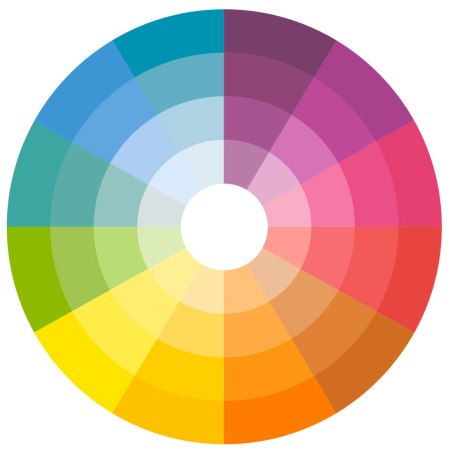
The blues/aquas and orange/corals in the room are opposite each other on the color wheel–complementary colors. Complementary colors are the boldest choice but work well together. Now a green paint color, while soothing, didn’t appeal as much. I opted for a shade of aqua that complements the oranges and coral.

The addition of a headboard and a surprise pop of neon green in the accent pillows complete the redecorating project. A nearby bathroom uses a clearer version of aqua on the walls. The color feels fresh and appealing to me. I’m hoping our next guests will enjoy it too.