Certified Color Expert
While I have done color consultations for many years, I just got certified in being a Color Expert Consultant with Home Staging Resource (HSR)
Color is emotional and evokes a particular feeling. When the color combination is “right,” it feels right. And when the color combination is not right, you know something is amiss but don’t know how to fix it. As a professional home stager, I immediately know when a room just doesn’t feel right. But now I can use the appropriate terms to explain what the problem is before giving alternatives.
Is there a perfect color?
There are no bad colors, just not the right application for a particular color. Colors look different depending upon the lightness of a room, what other items are in the room, and what the undertone of that particular color conveys.

Photo by Turan Designs, Inc. – Search kitchen design ideas
What is an undertone?
Adding gray to a pure hue gives an undertone of what that hue originally was. So, adding gray to red, gives a pinkish/purplish undertone.
Chemical Composition
All paints contain a mineral called Titanium dioxide. Titanium dioxide is the most widely used white pigment because of its brightness and very high refractive index, optimizing the maximum reflection of visible light. This mineral reflects natural light toward the blue spectrum, so our eyes tend to see pure whites as ever-so-slightly blue.
Four Types of Whites
Take a piece of copy paper and use it as a back-drop when choosing whites. You will then notice the very slight undertones of each white.
- Pure whites
- Off-Whites
- Creams
- Tinted Whites
Every home should use a type of white whether it be in the ceiling to reflect the natural light, the windows, mouldings, built-ins, or cabinetry. Choose wisely depending upon what the other finishes are. For example, use creams if you have brown finishes; use white if you have bright colors or blacks/grays.
Cream paint with cream cabinets and brown accessories Photo by Robert Thomas Homes – Search kitchen design ideas
Choosing Neutrals
There is no such thing as a pure neutral. All neutrals have undertones of the initial color.
There are two neutral categories: beiges and grays (whites and blacks are secondary neutrals).

The undertone is green in this gray neutral Photo by Pearce Scott Architects – More bedroom ideas
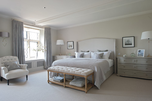
The undertone is yellow in this beige neutral Photo by Sims Hilditch – Browse bedroom photos
Choosing Colors
Not all colors “play nice” with each other. You need to look at the color wheel to determine which colors work well. For example, colors across from the wheel, complement each other, i.e., red and green. Colors in a triangle on the color wheel (triad), are pleasing-to-the eye combinations.
Instead of being concerned about undertones, you should look at the saturation of the color. Highly saturated colors are bold and bright and should be used sparingly. A whole room painted in highly saturated colors feels claustrophobic to me.
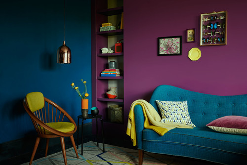

Photo by Adeeni Design Group – Browse dining room photos
When a saturated color is done sparingly or as an accent color, it can be stunning.
Do you need a color consultant?
I have a 6-step process to help choose the right colors for your home. Let’s work together to get you the look and feel that is “just right” for you. Call Premiere Stagers & Realty at 608-345-9396.